An essential part of working as a UX designer is retrieving user insights. This allows you to find out if your design is meeting users' needs and then improve your design. By creating a prototype and presenting it to end users, you can retrieve valuable insights. There are different types of prototypes, each suitable in different situations. We explain these here.
What is a prototype?
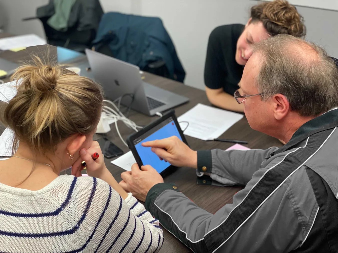
A prototype is an elaborated potential solution to a specific design problem. In the context of digital products, it is a simulation of the interaction between the user and the interface. With a prototype, you can see how users use and experience your design, thus finding out if the solution answers the problem well. You can create a prototype as part of the design process, to communicate with team members or stakeholders, or to validate assumptions with end users. We do the latter through a usability test, or as part of a design sprint. There are different types and sizes of prototypes, from hand sketches to fully animated screens, and from a few interactions to an entire product with multiple flows.
Why test with a prototype?
Whatever type of prototype you get started with, the main purpose of testing is to gather reactions from users and use them to improve your design before you actually develop the product. Developing an application or Web site without testing it first can lead to unnecessarily wasting resources if it turns out that it does not meet users' needs. By prototyping and testing during the design process, you find out early on what works and what doesn't work with your design and can make improvements immediately. This will save you a lot of time and money and you will arrive at a user-friendly, desired product in a more efficient way. In short; testing with prototypes has a great influence on the ultimate success of your product.
Fidelity level
The "fidelity" level of your prototype means to what extent your prototype matches the final product (the level of detail and realism). The fidelity of your prototype can range from low-fidelity to high-fidelity and differ in the areas of interactivity, visual design and content. Which type is most appropriate depends on the purpose of your test, how far along you are with your design, the tools at your disposal, the time available, and the conditions during the test.
Low-fidelity prototyping
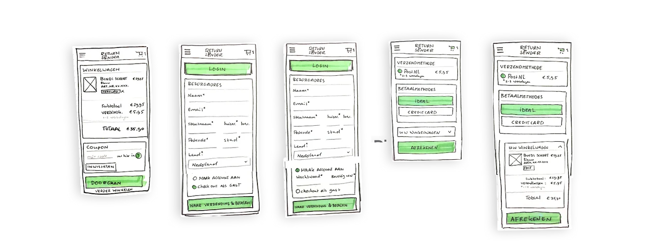
Low-fidelity prototypes are simple prototypes that allow you to quickly test high-level ideas or concepts for a digital product. They are suitable, for example, to find out early in your design process what users think of your concept (and whether they need it at all), or to test a certain flow before you have the visual design all worked out. So the main purpose of low-fidelity prototypes is to test the idea and functionality rather than the visual design. The emphasis is not on details. Basically, the less "proof" you have of your product's existence and other assumptions about your product, the less effort you should put into creating your prototype. Low-fidelity prototypes are often sketches on paper. This method of prototyping is also called paper prototyping.
Interactivity: Design elements of low-fidelity prototypes are not clickable, since they are sketches on paper. Screens are presented to the user in real time by a person. That person then plays the side of the "computer" and responds to user actions by switching between different sketches of screens.
Visual design: None or some visual elements of the final product are elaborated (only shapes of elements and basic hierarchy).
Content: It contains only the most important content relevant to the purpose of the test. Other text and images are represented by mock-ups.

Advantages of low-fidelity prototypes
- 1. It takes less time than building a high-fidelity prototype, so you can get feedback faster.
- You get feedback on the concept and functionality without "distracting" users or stakeholders with the visual aspect. This is useful in the early stages of a project when you only want to get general feedback on the idea and functionality.
- There can be less pressure on the participant during research. Because the design looks like a sketch, the user gets more of a sense that you are actually testing the design and not the user themselves. This makes him/her more inclined to give honest feedback on your design.
- As a designer, you feel less attached to your design during concept development because you have put less time and effort into creating your prototype. This makes it easier to incorporate user feedback into an updated design (though of course you should always keep doing that!) and iterate faster.
- It's also accessible to non-designers. Anyone can doodle and thus participate in the design process and think about the design.
- You don't need a digital tool to create it.
Which fidelity type is most appropriate depends on the purpose of your test, how far along you are with your design, the tools you have at your disposal, the time available and the conditions during the test.
High-fidelity prototyping
High-fidelity prototypes look and function (almost) the same as the final product. The design is worked out in detail to the extent that it can undergo usability testing. In fact, compared to low-fidelity prototypes, you put more effort into creating a high-fidelity prototype because what you want to learn is also more complex. In fact, high-fidelity prototypes are applied more at a later stage when you want to test the interaction and usability of your design and find out issues. It is also good for UX designers during the design process to quickly develop a flow into a clickable prototype to see how the design works and feels in action. High-fidelity prototypes are digital and can be created in tools such as Figma, InVision or Keynote.
Interactivity: The interactions of high-fidelity prototypes are very realistic. Most elements (at least those being tested) are clickable and screens are linked together so that the user automatically gets reactions to his/her actions.
Visual design: Graphics, layout and spacing are realistic and detailed and look like a real app or website.
Content: Real content, such as product descriptions or articles, is used.

Benefits of high-fidelity prototypes
- High-fidelity prototypes have more interactivity and therefore look more like "real" software. As a result, users respond more naturally.
- You can test in more detail and address specific components, such as usability issues and how users experience interactions (such as transitions between screen). This is impossible with pen-and-paper prototypes.
- If a prototype is also more visually fleshed out, insights can be gleaned about brand appearance and accessibility.
- High-fidelity prototypes are more presentable for stakeholders because they can get a better idea of how the product looks and works before it goes live.
- There are several fairly simple digital tools today such as Figma and InVision that allow you to put together a full-fledged prototype in no time, especially if you have experience with them.
- A high-fidelity prototype is more appropriate when fewer people are available to observe the test. The designer can then fully focus on observing the user without having to be busy making the prototype work himself.

Medium-fidelity prototypes
Between the above low-fidelity and high-fidelity prototypes as extremes, there are of course more options. For example, if you want feedback on the general structure, navigation and the way users interact with your product, but you are not yet ready to develop the product in detail and visually, you can also choose to create clickable wireframes or work out your product partially visually. Basically, of course, you work out what you want feedback on.

Conclusion
A concept that doesn't really solve the user's problem, unclear navigation or poor accessibility. It is very important to discover these findings early during product development. It is the job of the designer and researcher to test the validity of the design through prototyping.
Whether you deploy a paper prototype, wireframe mock-up or a high-fidelity prototype to find out user findings depends on your time, testing goal and resources. Most importantly, learn to improve your design at the right times in response to valuable test results.

