Almost everything and everyone uses language. In short, you could say that people use language for three reasons: to communicate (communication), to express themselves (expression) and to describe reality (conceptualization). There are many different languages, yet on average, languages fulfill these three functions, whether it is Swahili, CSS or sign language. An important property of language is that it follows a set of common recognized rules, but at the same time it is fluid: it constantly adapts its rules to meet the changing needs of its users.
Since the advent of computers and development of various ICT technologies, there has been a need for language that allows humans, as well as technology, to communicate among themselves. Take HTML, for example, a programming language that allows humans to communicate with computers to create a hierarchical, informative Web site on the Internet. As the expressive side of HTML fell short and users began to feel the need to experience more visually exciting Web sites with color and animations, languages such as CSS and JavaScript arose to fulfill this need. The need for more visually challenging websites and the trend toward increasingly complex Internet applications is not surprising when you consider that the average person in the U.S. spends more than 2 hours a day on his/her cell phone and more than 4 hours in front of a PC.
Fast-forward to 2020: welcome to the world where flat HTML websites have given way to websites running component-based React websites where animations, colors and interactions are flying around your ears. More complex, visually challenging web applications for various multimedia devices mean that code: is becoming increasingly complex and bulky, must be suitable for a wide variety of devices and screen sizes, and is increasingly written in larger teams. It is therefore not unexpected that a need has arisen for a programming language that better suits the new needs of Web developers. Styled-components are a good example of a language developed out of this need.
Styled-components
Styled-components are one of the latest developments in component-based styling. It is a "CSS-in-JS Library" that allows Web developers to apply styling in the form of components, which are rendered in the React template without having to be linked to an associated CSS class. In short, Styled components satisfy: expressive (CSS), communicative (more explicit & concise naming) and conceptual (linking components & styling ) needs arising from the React community.
To illustrate: In the past, a typical styled React component would adopt the following code when using CSS classes for this purpose.
<h2 className="title primary">Hello World</h2>h2.SubTitle{font-size: 2em;color: green;& .primary {color: red;}}
When using Styled components, the same output can be achieved by the following code:
const Subtitle = styled.h2`font-size: 2em;color: ${props => props.primary ? 'red' : 'green'};`<Subtitle primary>Hello World</Subtitle>
Benefits & Challenges
The difference in the code described above can be summarized in the following benefits that come with using Styled components:
- Less code in the template: using Styled components offers the possibility to abstract conditional styling logic from the template into a styling file, and replace it with just the styling props.
- More explicit code: Gone are the days of 20 <div>'s and <span>'s in a component template containing the repetitive className={...} to refer to one of the many CSS classes. By using Styled components, one only imports a Styled component with a descriptive name such as: <RedListContainer/>. This saves code and is more explicit than <div className={Styled.redListContainer}.
- Native mobile support: Styled components offers developers the flexibility they have come to expect from CSS for both React and React Native, and can therefore be used cross-platform for styling components.
Still, using Styled components poses some challenges on the development side. When a large number of different Styled components are used in a component, this results in a long import list at the top of the component. The naming of Styled components can also be left to the developer. When many unique Styled components are used in a React component, this quickly makes naming confusing. For example: <RedContainerWrapperBig> vs <RedContainerWrapperBigMarginEight/> vs <RedContainerWrapperBigMarginTen/>. This complicates the conceptual function that an effective language has, because its users can no longer easily form a common idea of what is described by the name.
In the case where many unique Styled components are required in a component, this requires a lot of switching back and forth between the styling file and the React component during coding. It also makes it difficult to quickly distinguish between standard Styled components such as <View/> or <Text/> and custom Styled components such as <ViewRed/> and <BigText/> when they are used alternately in large numbers within one component.
'Import as * as Styled from'
When we use Styled components in a React component in Humanoids, we first define this Styled component in a -.styled.ts file. The Floating Action Button component below is a good example of this
├── floating-action-button│ ├── FloatingActionButton.styled.ts│ └── FLoatingActionButton.tsx
In this file we define all Styled components using a descriptive, concise name (starting with a capital letter) and then export them:
export const ButtonView = styled.View`align-items: center;background-color: ${(props: Props) =>props.disabled ? color.secondaryDisabledLight: color.primary500};border-radius: 50px;box-shadow: ${(props: Props) =>props.disabled ? 'none' : shadow.elevation4dp};elevation: ${(props: Props) => (props.disabled ? 0 : 4)};flex: 1;justify-content: center;`export const ButtonSize = styled.View`height: 56px;width: 56px;`export const MiniButtonSize = styled.View`height: 40px;width: 40px;`
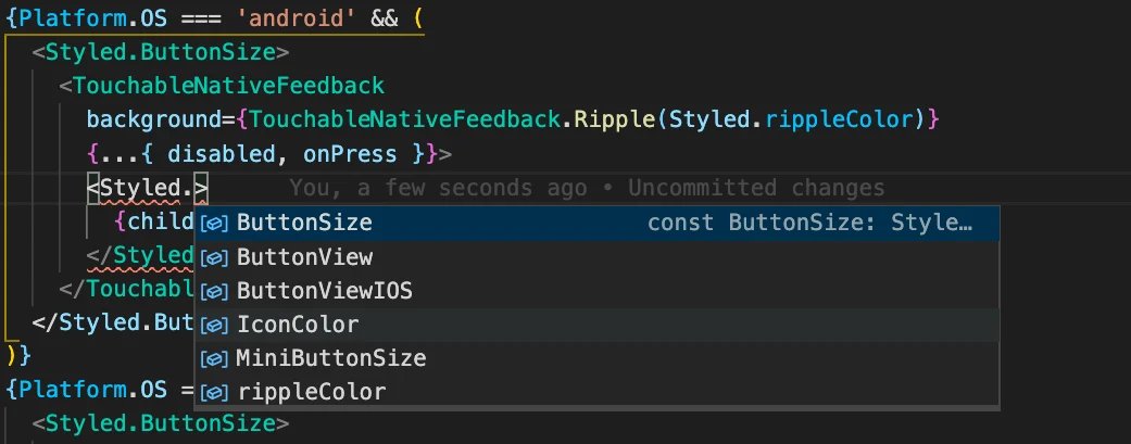
Then all these Styled components are imported into a React component in one line of code. If these Styled components were imported separately, this would require significantly more code.
import React from 'react'import { TouchableNativeFeedback } from 'react-native'import * as Styled from './FloatingActionButton.styled'
This method of import also means that the developer can then enter <Styled. can type, after which the entire list of associated Styled components becomes visible within the React component. This saves you having to switch between the styling file and the React component and makes a clear distinction between custom Styled components (via the 'Styled.' label) and default Styled components (in this case a TouchableNativeFeedback).