
More and more companies are using a design system these days. As a result, design tokens have also come onto the radar of more and more companies. But what exactly are design tokens and what use are they?
Design tokens, just like a design system, can ensure consistency in design and development teamwork. Design tokens can also speed up and simplify the design and development process. In addition, design tokens offer a solution above all for design systems that have to serve multiple brands and themes. Curious how exactly this works? We'll explain it to you!
What are design tokens?
Design tokens are often used in combination with a design system. A design system is an overview of reusable components (such as buttons, cards and menu items) with an explanation of how and when these components may be used. In addition, a design system records what these components look like: which fonts, font sizes, dimensions, distances and colors are used. The idea behind a design system is that standards are created for both designers and developers, which improves and accelerates the design process. Design tokens are a useful tool to use when changes need to be made to the design system and you want to implement these changes in multiple components of your design system at once, or even directly in your live product.
The styling of components from your design system can be stored in design tokens (such as colors, fonts, text sizes, distances and dimensions). By using design tokens, you record the styling of components as data, so to speak. By linking the components from your design system to design tokens, you create a central place in which you manage the styling of your design system. You can link multiple components to the same design token and thus adjust multiple components in an instant by changing the value of this design token.
Example:
You use a text size of 16 for the text of buttons in your design system. You create a design token in which you determine the text size of a button and set its value to 16. You then link all buttons in your design system to this designer token. When you then adjust the value of your design token from 16 to 18, all buttons will have a text size of 18.
The unique thing about design tokens is that it can contain multiple styling properties and formats, allowing front-end developers to use the same design token regardless of the application they are working on or the programming language they are using.
Why design tokens?
Design tokens act as a single source of truth for a design system, which makes managing and adjusting it a lot easier. Design tokens also ensure that everyone in the team, regardless of their position or the programs they use, speaks the same design language. This creates clarity within the team, and also ensures consistency in the use of styling elements.
One of the biggest challenges of large-scale design is maintaining consistency within a design and between the designs of different products. By referring to design tokens within a design instead of using static values, the same styling is applied everywhere and you ensure more consistency within a design and between the designs of different products.
The use of design tokens has also made adding or adjusting styling properties easier and more efficient, which in turn provides a more flexible and scalable design system.
When do you use design tokens?
Design tokens are suitable for use in the following scenarios:
- When you use a design system for more than one platform or product;
- When you are looking for a simple and efficient way to maintain and adjust the styling of your products;
- When you plan to change the design of your product or add new products/features.
- When you have multiple versions of your design, such as a light, dark and high-contrast mode.
Design tokens are less suitable to use when:
- You do not plan to make any adjustments to (the design of) your product in the coming years;
- You do not use a design system to design your product.
How can you apply design tokens in your design?
To be able to work with design tokens, you must determine a number of things in advance. If you are already working with a design system, much of the information you need will already be in it. You define design tokens based on your design system.If there is no design system yet, you will first have to define your fundamentals and components. These are the building blocks of your design. Once you have done this, you can take the next step, namely defining these building blocks as tokens. We do this using the Figma plug-in Tokens Studio.
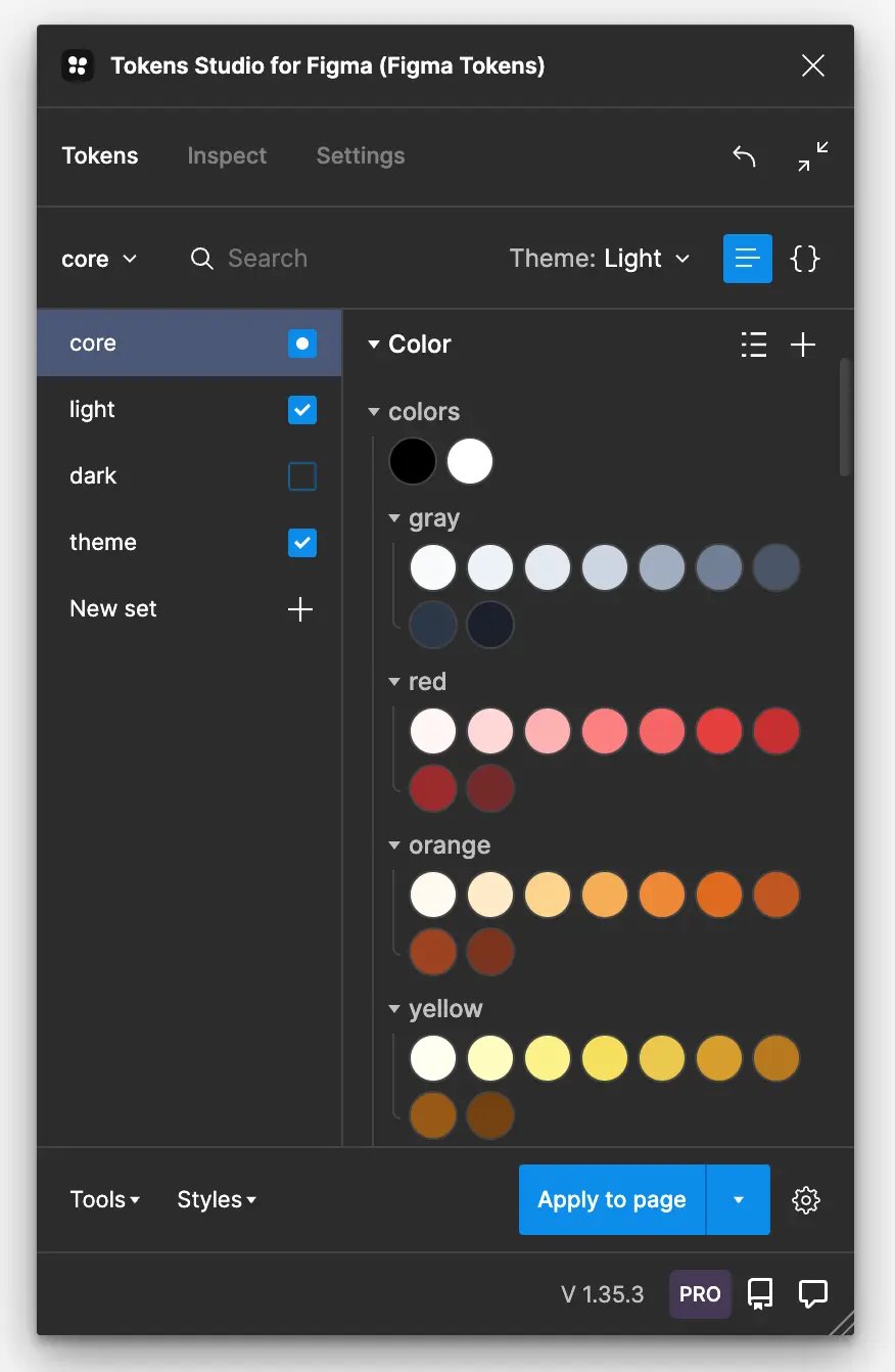
Tokens Studio: Creating Tokens
Tokens Studio for Figma is a plugin in which you can easily create your own tokens. You can easily install this app in your Figma file. When you start setting up your tokens, do this based on your previously defined styles from your design system.
There are three layers in which you can create tokens:
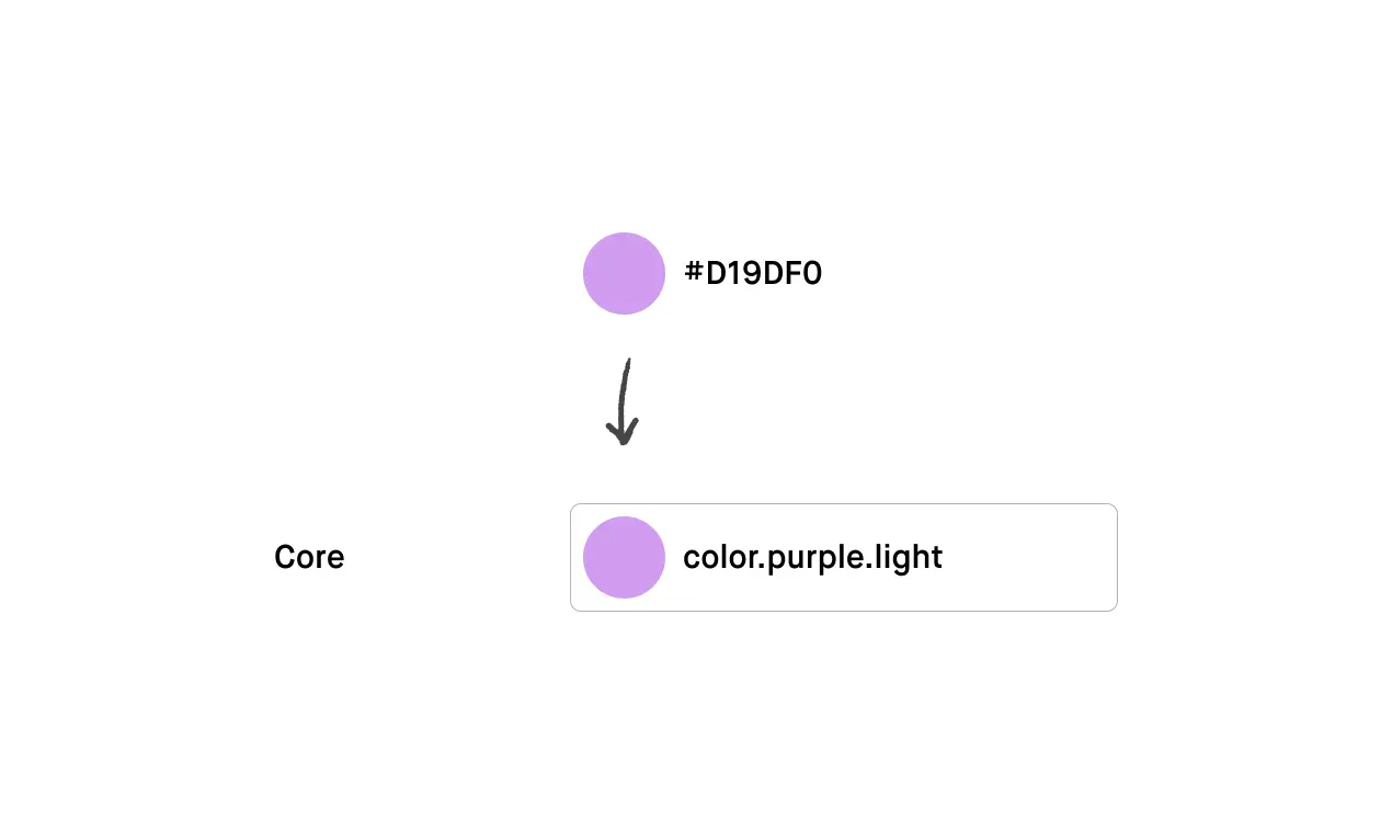
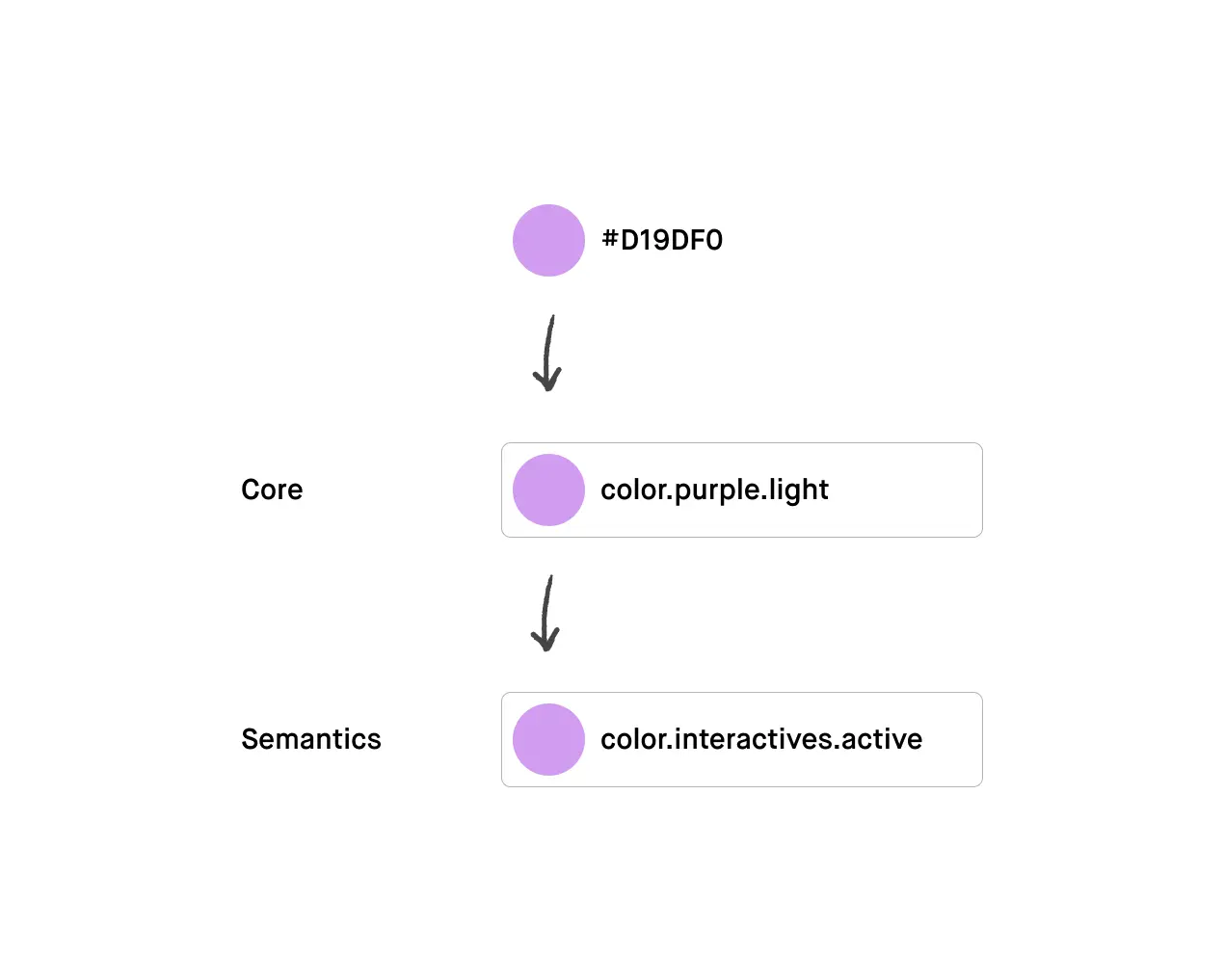
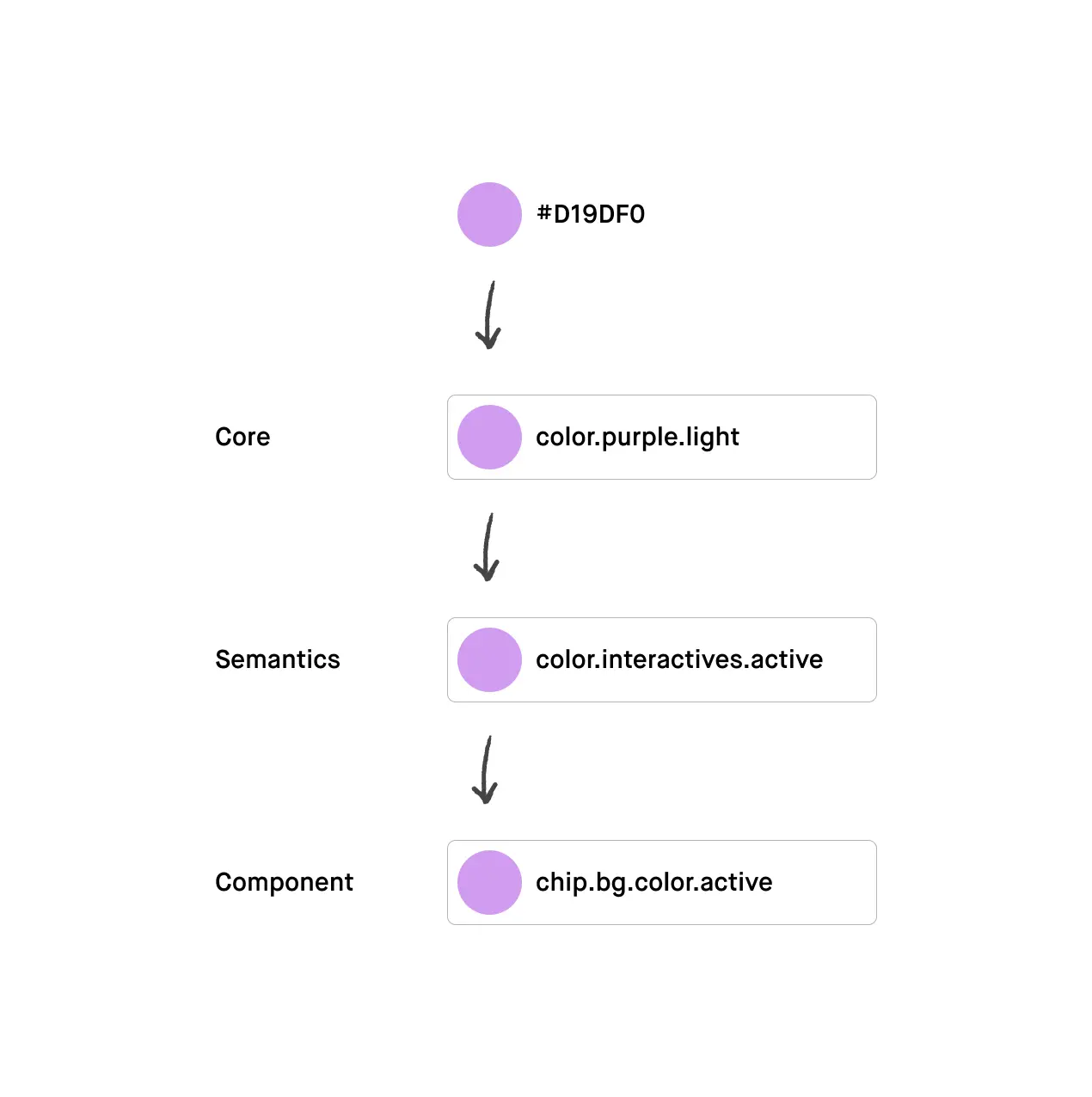
1. Core tokens
In your core you will define which colors, spacing, borders, etc. you need in your design system. You can add the entire color palette and all possible spacings, fonts and font sizes that you think you need. Build your core tokens in a logical manner and maintain a system for naming colors, for example.
2. Semantic tokens
Now that you have put all the options in your core, you can continue with determining your semantics. Here you indicate, for example, which color is the primary color and which color is the secondary color. You also determine the headings here; these are the combinations of the font type, font size and font weight that you use in your design. To define your semantics, use the tokens you previously defined in your core.
3.Component tokens
You can then also define component tokens. These are the fixed combinations of tokens that you assign to a component, such as a button. You will often always use the same border radius, color and font for a primary button. By using component tokens you keep your token structure clear and ensure that your designs are consistent. Here you use the tokens you previously defined in your semantic tokens.
Use cases (by humanoids)
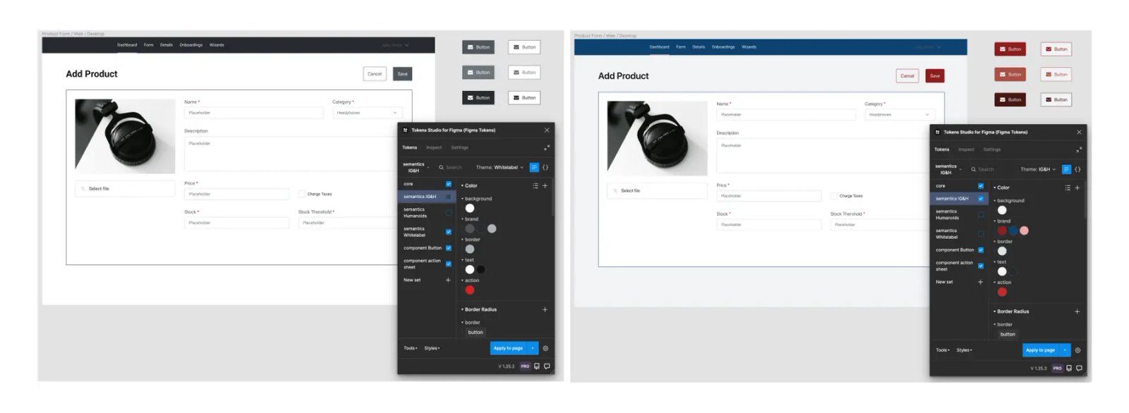
Of course we also used design tokens. Humanoids recently worked for IG&H on setting up a multi-brand design system. We have also started the migration of the design system from Planon in Sketch to Figma, where design tokens have been implemented.
IG&H: Multi-Brand design system.
IG&H develops dashboards and apps for customers in various sectors, where the customer's corporate identity is applied. To further standardize and optimize IG&H's working methods, there was a need for a design system that can be used for all these different brands. Humanoids is asked how you can best set up one design system that can be used for all these different brands. Design tokens come in handy for these types of issues. By using design tokens you can assign the styling of multiple brands to the components in your design system. You do this by creating different sets of semantic tokens in the Tokens Studio Plugin. This allows you to easily switch between styling options without having to set up a new design system.
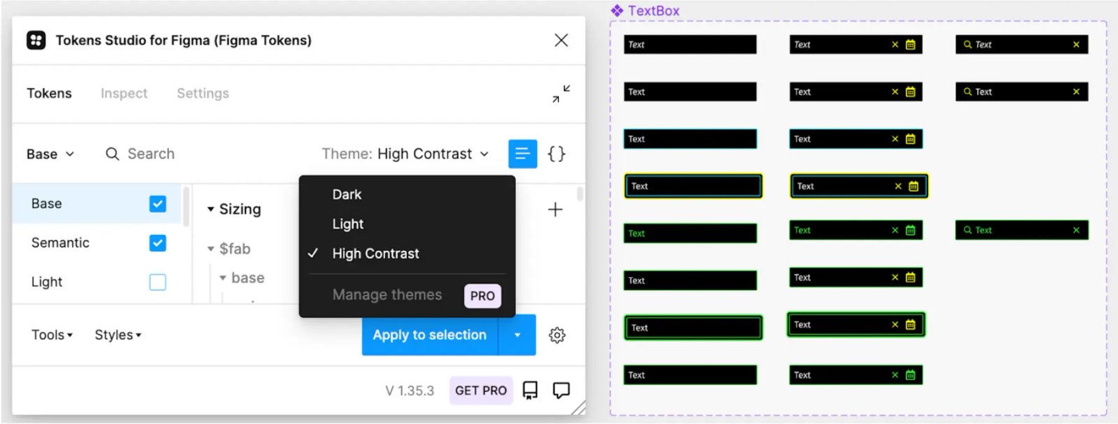
Planon: Dark, light and high-contrast modes
For Planon we started migrating their current design system in Sketch to Figma. In addition to transferring components and making them interactive, the question was also whether we could implement the design tokens in the new design system. Planon itself already worked with design tokens and had therefore already defined them. Based on the defined tokens, we started working with the Tokens Studio plugin. In addition to the values for the 'standard' light mode, we were able to indicate per token how these change when switching to a dark mode or a high contrast mode.
After carefully building the tokens and replicating a number of components, we could attach the tokens to the components by selecting different parts (think of background color) in a component and selecting the matching token in the plugin. In Planon's new design system, which is implemented in Figma, it is now possible to easily switch between the different modes (without having to build these modes).
Getting started with design tokens
There is still a lot to discover about design tokens and developments within Figma and Tokens Studio are still in full swing. A good time to get on this moving train and delve into the possibilities of design tokens for your organization. Do you recognize yourself in the above situations and would you like to know more about the benefits and applications of design tokens? Our UX and development experts are happy to think along with you!