
How do we create a redesign that must meet very strict usability and accessibility requirements? A redesign that complies with all technical, legal, ethical, political and security frameworks. This is the challenge I (Rowan Verbraak) have been working on for the past six months.
The redesign in question, is a Mine environment of a digital product with a user base of 14 million citizens, enabling them to conduct government business. Because it is a public domain website, it must meet strict accessibility requirements (think WCAG). But it must also be as simple to use as possible. Some obvious interaction patterns are still too complicated for many Dutch people, and certain settings may be too abstract to understand. How do you tackle something like this?
Collaboration is key
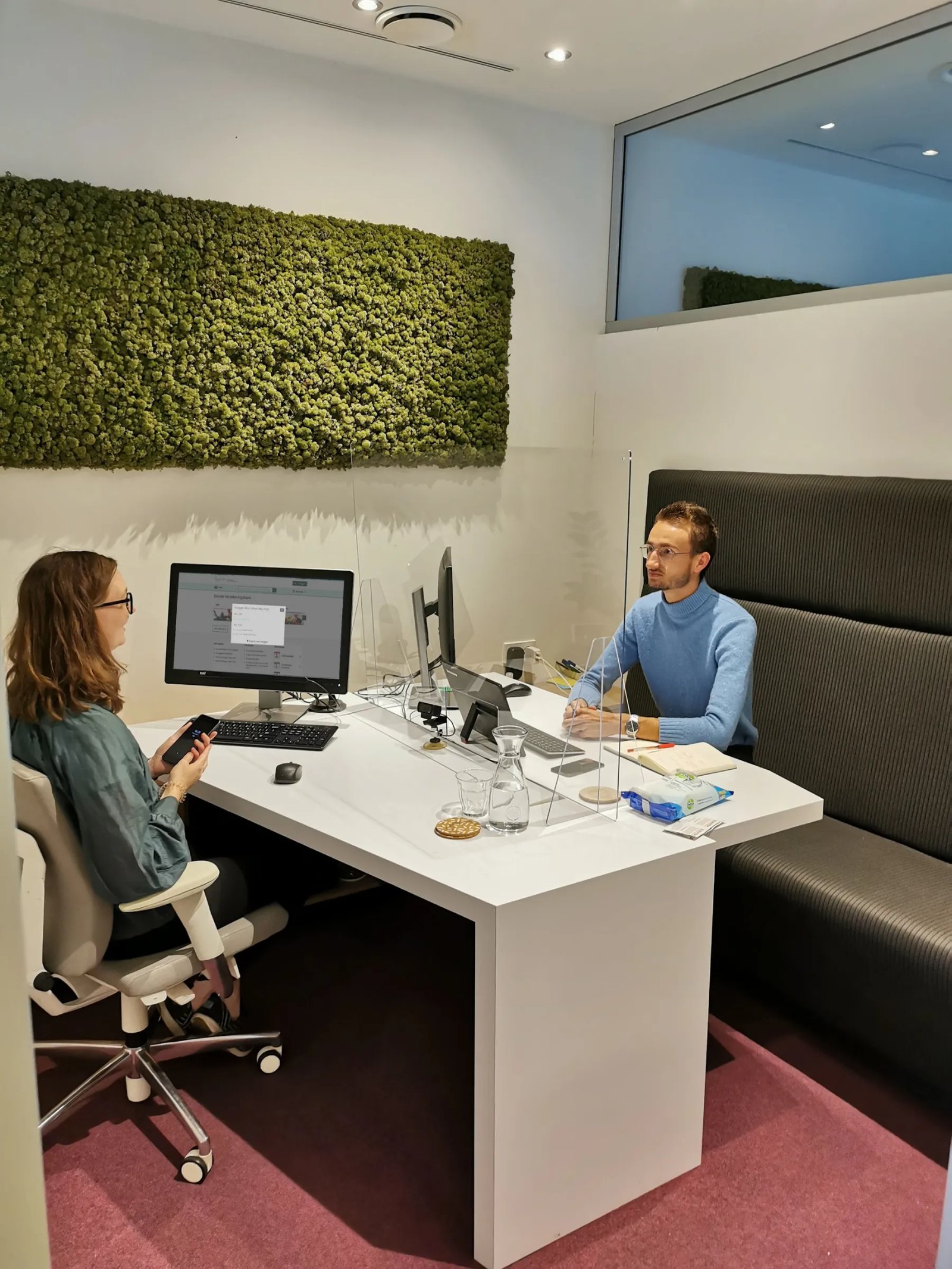
The answer lies in transparent collaboration. As a UX designer alone, you're not going to make it. It is impossible for one person to have a complete view on all the frameworks, requirements and limitations. It's simply too complex. Being the only UX designer on the product did require me to seek out the knowledge of my colleagues in other fields. Fortunately, there is an open atmosphere on the shop floor and conference calls fly around your ears. So throughout the process I involved my colleagues from UX, functional design, product owner, UX research, architecture, communications, customer contact center and development and asked them to help build something that will really help citizens.
Test your products with the whole team
This starts with examining the "problem space. Why do we need a redesign? The first reasons surfaced during a user survey with visually impaired citizens. In the context of accessibility, we have such a test at least once a year, mainly because the WCAG guidelines are not enough to make your product truly accessible. It is only accessible if the target audience experiences it as such. For example, during the test we saw that certain buttons fall out of view for people who use Zoom software. But also that the layout of the page screen-reader does not help users form a picture of the content. Because this research was jointly led and conducted by myself, the UX researchers, a functional designer and my product owner, the need to improve was immediately widely shared within the teams. Together, we see an opportunity to help these citizens.
Next, reasons for improving this My environment came from several angles. User research with average citizens indicated that people were overwhelmed by the long vertical column of information on the landing page. In addition, a new long-term product vision was being worked on in the meantime. For example, certain institutions needed to be more prominent and we want to give citizens more control over their digital security. Last January, we had a good idea of the "problem space" within the teams and I began a step-by-step redesign.
Iterate, iterate, iterate!
First you and your colleagues review the information architecture (layout and structure) of your pages and content. When this passes all technical and legal requirements, you create a visual design for different screen sizes. Then you test these with users and iterate. Finally, in addition to the screens, you build a component Library and style guide for both Light and Dark mode together with the developers so that everyone is well versed in the subject matter. The latter is where I am right now. Together with the developers and functional designer, we are connecting the dots on the components, including accessibility.
One of the most notable changes is that we added a banner at the top of the page with bold letters and not-to-be-missed colors. This banner asks citizens to increase their digital security. This can be done by setting certain settings to active. The test with citizens showed that this banner, along with other elements, very effectively "nudged" (directed) the user. For example, we saw that people want to make an effort of their own accord to turn red elements green. This allows us to properly guide citizens in increasing their digital security.
Not only the end user benefits
By sparring together, we now have a product that is demonstrably better experienced by different types of citizens. A product that is more future-proof and has even increased cohesion in the teams. Because something great that you make together always gives a sense of pride. I myself always get tremendously excited about very complex products, but that's how I grew after I learned to carry everything on my own. You can puzzle endlessly, but you will always make mistakes or miss opportunities. I had those during this process, too. Ask for help and advice and respect others' areas of expertise, then they will do the same to yours. Then at the end there will be a strong product for the customer, stakeholders and especially the end user.