Power features
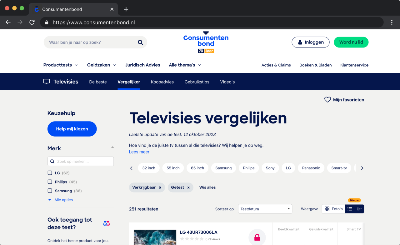
The Consumentenbond website offers a product comparison tool, allowing users to visually compare certain test scores of products (e.g., sound quality, image sharpness, or ease of use).
In a scrum team, we worked on optimizing this comparison tool by focusing on overall user experience, usability, accessibility, and customer benefits.
Two ways we improved the usability of this feature were by enhancing the comparison on mobile devices and introducing a 'favorite' functionality to save products for later and easily access them again. To validate the effectiveness of the improvements, we conducted multiple A/B tests for certain features.
Improving the main navigation
By redesigning the navigation menu with a user-centered approach, we successfully improved its usability and accessibility, leading to increased user satisfaction and better item discoverability.
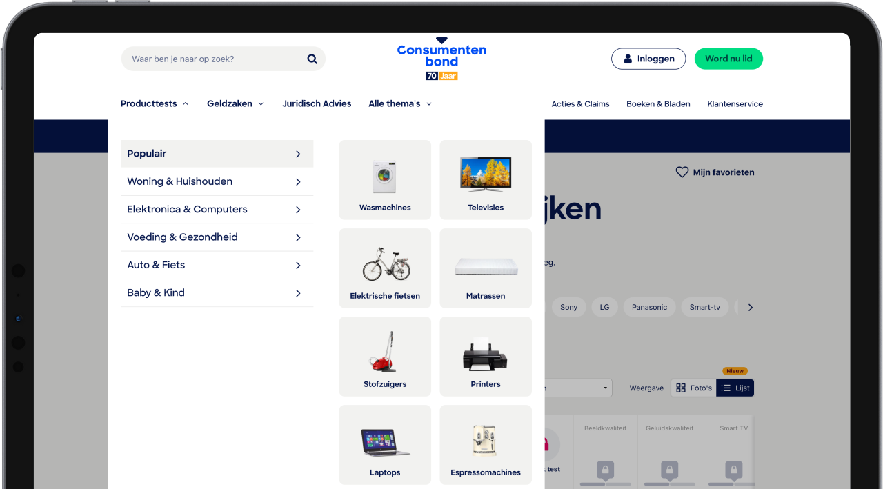
The Consumentenbond website comprises various sections and topics (such as the product comparison tool, financial advice, legal advice, and more). Users repeatedly reported issues with finding specific product categories and navigating through the website in general. Causes included a multi-layered page structure, the current categorization of product tests, and lack of responsiveness.
Throughout the entire design process, we closely collaborated with users to improve navigation by involving them where possible and validating ideas along the way. Some key aspects that were crucial included:
- Accessiblity: The new menu design must prioritize accessibility, including keyboard navigation, compatibility with screen readers, and color contrast.
- Information Architecture: Menu items should be arranged based on user feedback, grouping them into logical categories.
- Responsiveness: The new menu should work equally well on mobile and desktop.
After a card-sorting session with users and several design iteration rounds, the team was satisfied with the final result. As the last part of the project, we created a clickable prototype to validate the redesign through user testing.
Homepage redesign
We conducted a user test to understand how users perceive the Consumentenbond based on the homepage and whether it aligns with their mission and identity. Additionally, we looked at the overall user experience, including the look and feel, and their expectations and needs regarding information on the homepage.
Based on the results, we created a new design with reusable components that allow content creators to personalize the homepage based on the user's subscription.
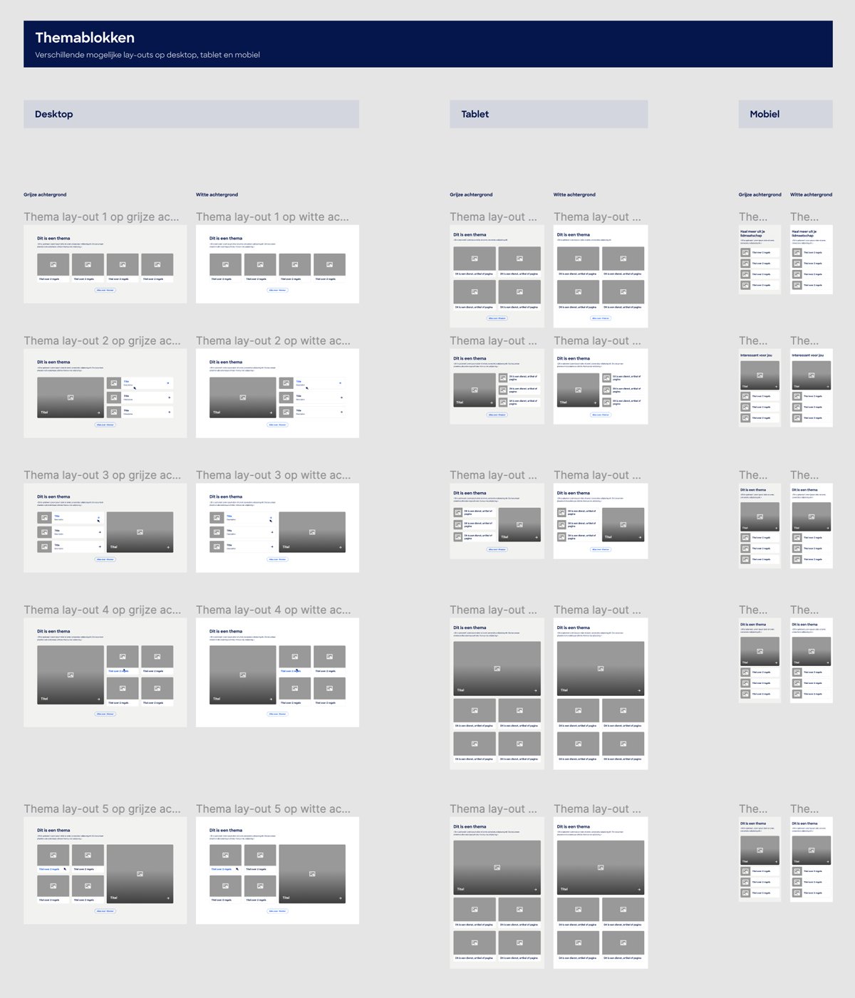
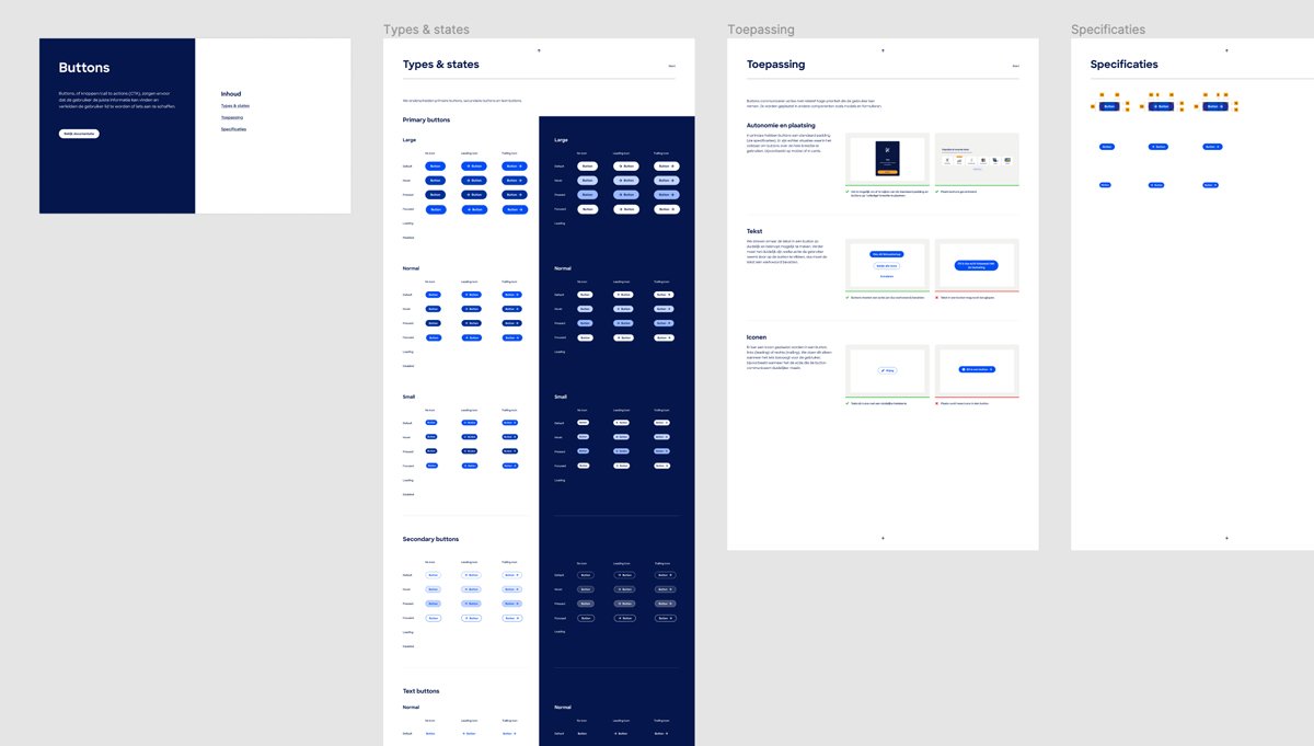
Design system
In addition to incrementally improving the current product, at the Consumentenbond, we took the initiative to enhance several work processes. One significant improvement was establishing a design system.
We noticed many inconsistencies in layout and design components (such as buttons and input fields), resulting in redundant work for the entire development team.
To address this, we set up a design system with clear standards for fundamental elements like colors, typography, layout grids, along with a set of standardized components. This not only improved product consistency and usability but also elevated collaboration within the team, leading to a more efficient design and development process.
A new way of working
Previously, the designers at the Consumentenbond used Adobe XD as their primary design tool. We guided them through the transition to Figma, resulting in significant improvements in the design process and collaboration with development.
Additionally, during development, we introduced a UX review as an integral part of the scrum process, reducing the gap between design and implementation and improving the quality of work.