The project
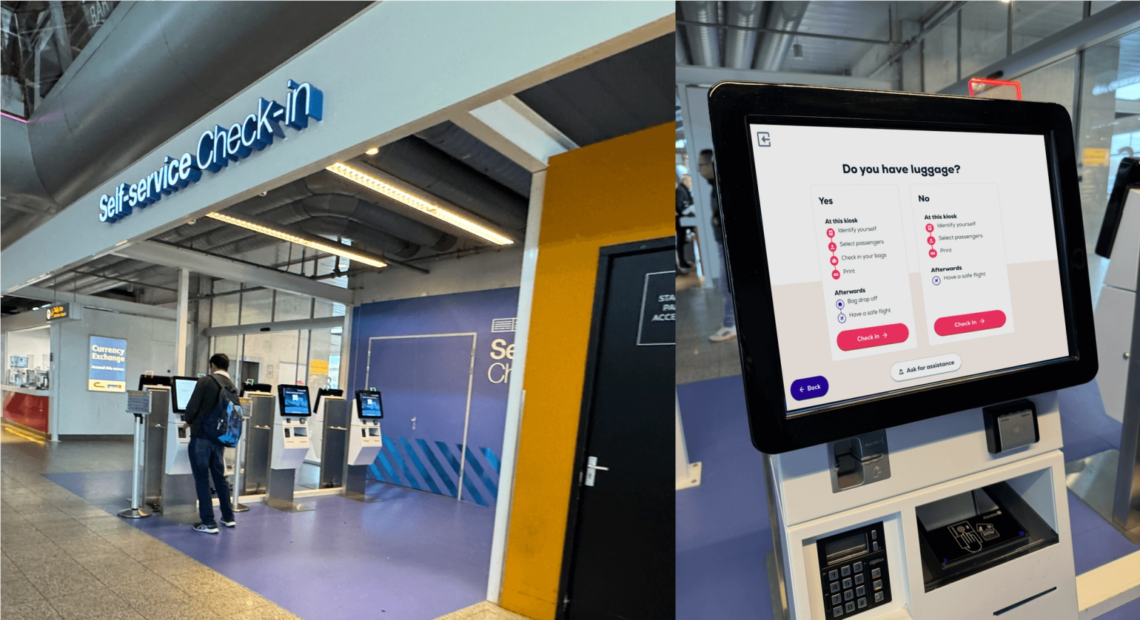
We designed a new interface for the Transavia self-service check-in kiosk. We observed and interviewed passengers of 4 Transavia flights going through check-in and pinpointed numerous problems with the old kiosk. Main problems were focused around unclear goals, confusing status and unavailable assistance.
Tappable and accessible
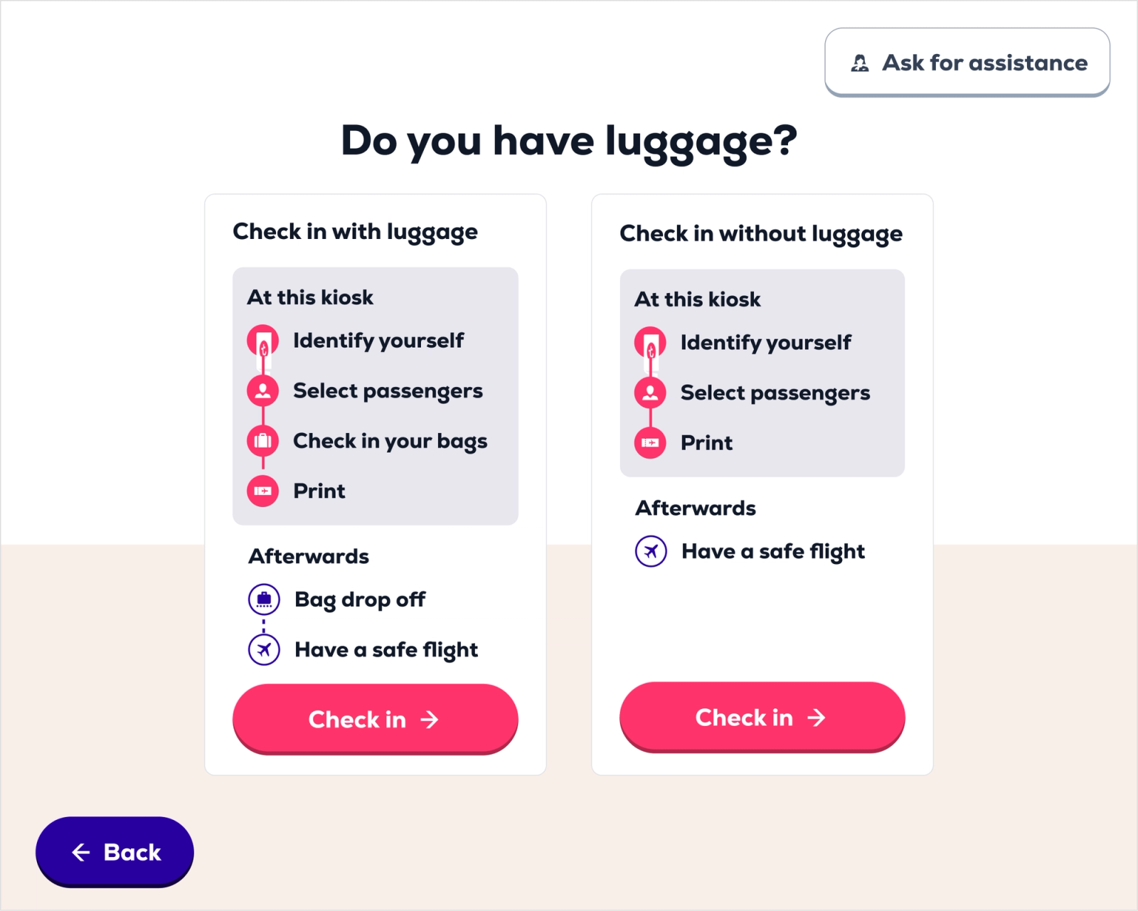
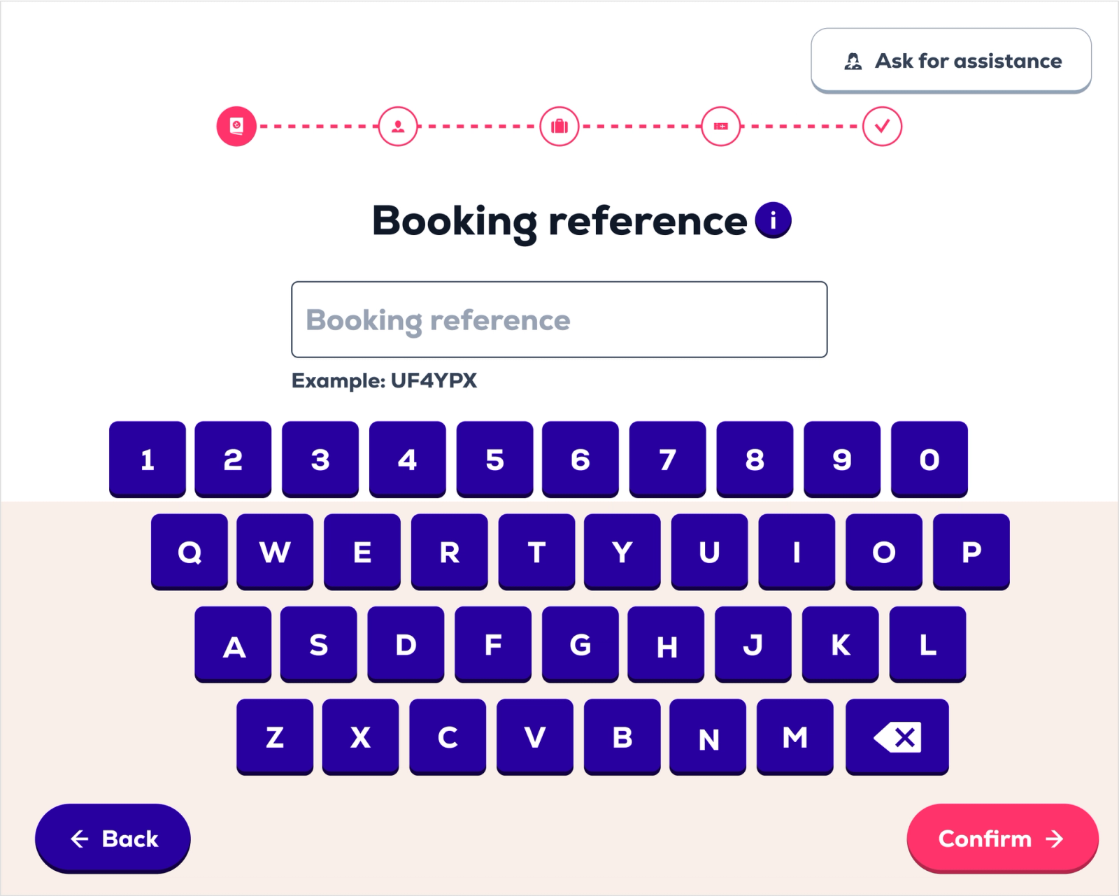
The interface is designed for usage with your finger, of course. The tappable areas are very large and clear. We also assessed the accessibility of the new kiosk interface and used a heavy font to comply with WCAG guidelines.
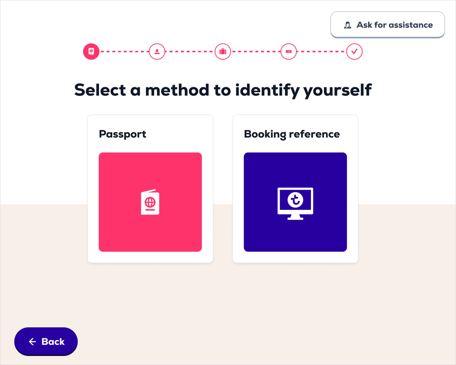
Booking reference
The booking reference is key in this flow. Users need to have it ready and/or be able to easily find it in their booking confirmation email. Which posed quite some problems and, right now, was not accessible (white on light green).
User testing outcomes
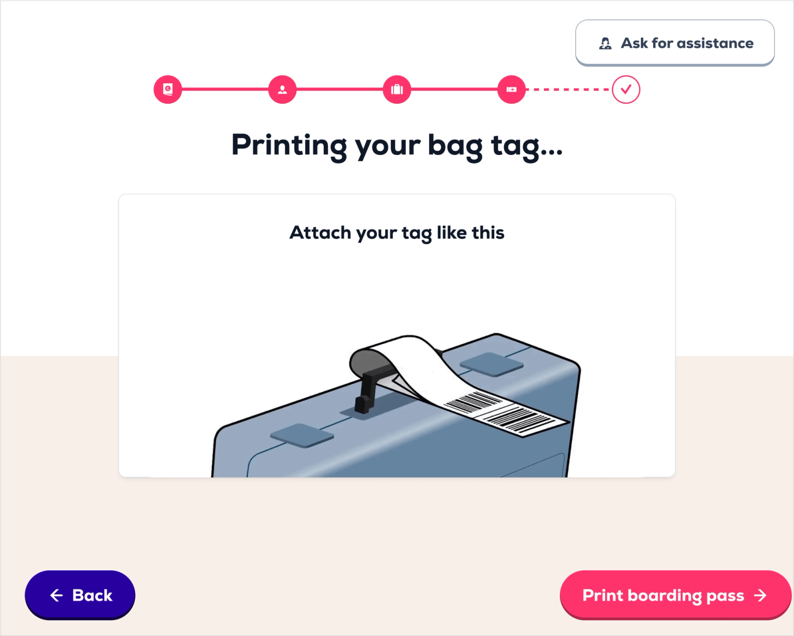
We bettered the design after having numerous user tests. We saw that the first question ‘Do you have luggage’ found a great balance between speed an reassurance. Also, clean illustrations effectively guide the user through the process (especially the ones that do not read). Participants showed appreciation for the clear visuals, heavy buttons and decluttered interface in general.