The project
For this very complex project, we used co-creation techniques to involve all stakeholders from the beginning. We interviewed both stakeholders and users and conducted user testing very early on to get a feel for the design direction that would provide the most value.
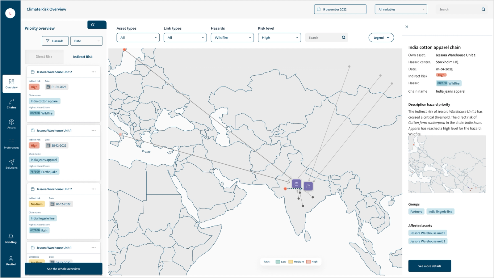
Geographical view
The first of the two chain views is the geographic view. In this view, projects are positioned geographically on a map. The focus is on the selected asset, which can be found in the middle. Assets that are not directly connected to the selected asset are shown in gray. Connected assets upstream and downstream are highlighted. The different lines show the relationship between assets.
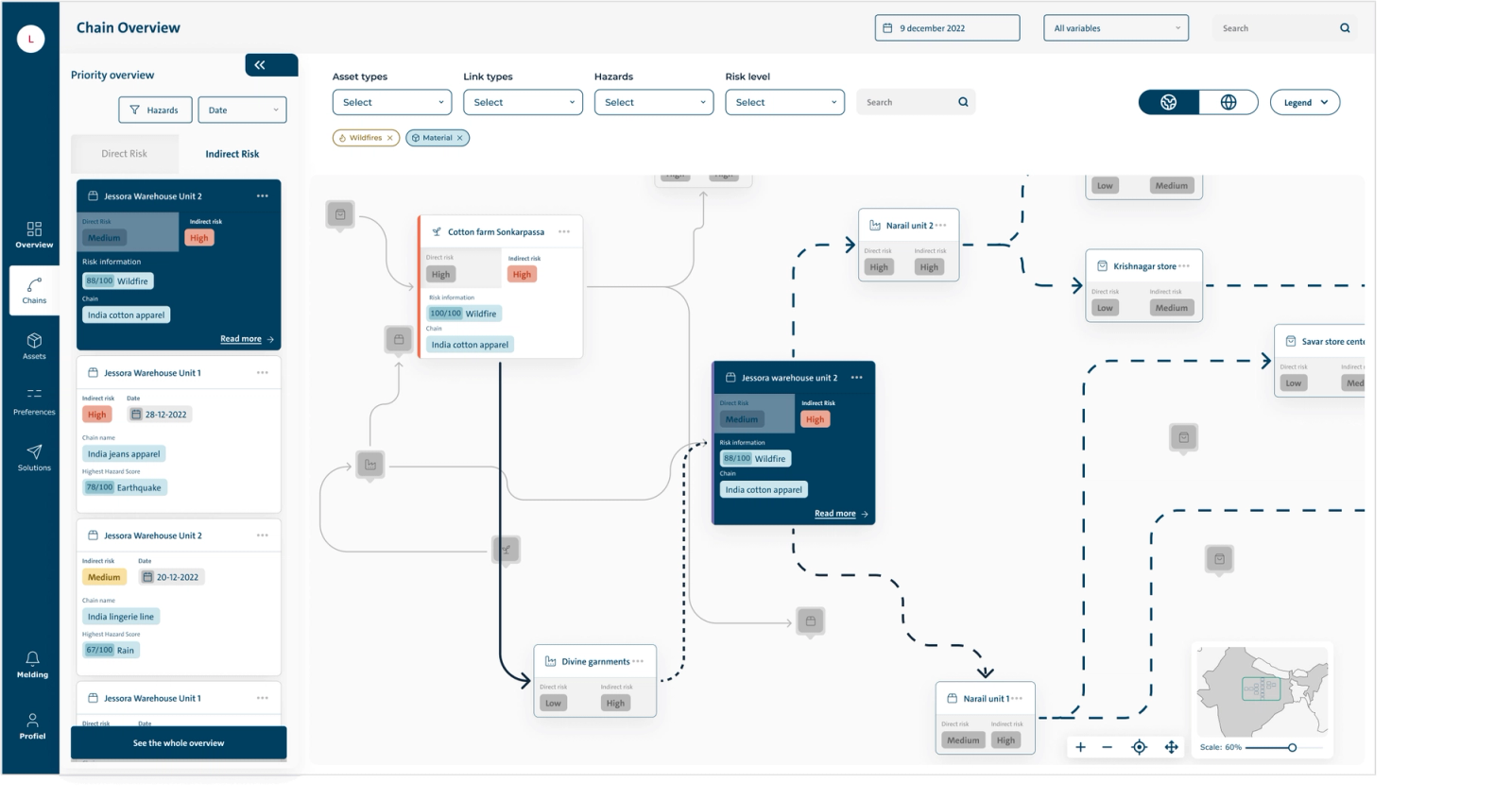
Schematic overview
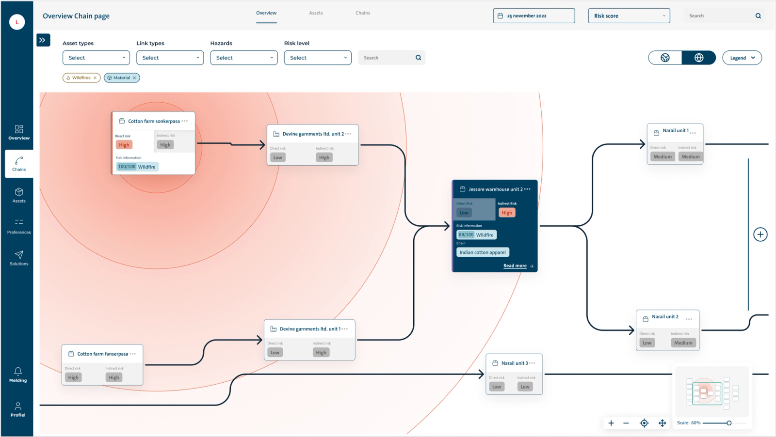
The second chain view is the schematic view. In this view, assets are not geographically positioned. The circles represent the range of an occurring hazard. The closer an asset is to the center of the circle, the higher the indirect risk. It is easy to recognize assets connected upstream and downstream. Clear overview of assets affected by climate impacts.
Context
Of course, the platform is much larger and has much more functionality than the few screens we show here. We can always show you more!
